Showing posts with label Paint. Show all posts

Thursday, March 31, 2011

I'm Such A Copycat

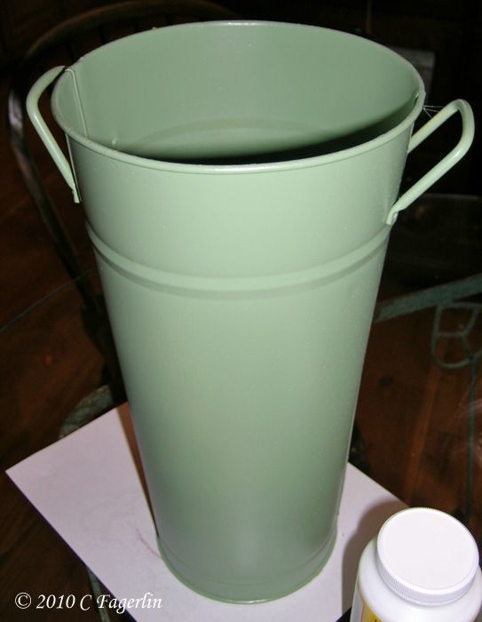
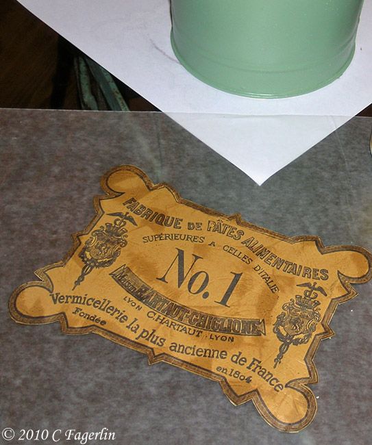
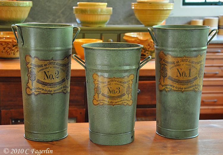
I saw this flower bucket re-furb at All Things Related using graphics
downloaded from Kristine Mckay Designs and remembered some French
flower buckets out in my garden shed.

One was pastel yellow, one pastel blue from Michael's years ago,
another was a nice heavy weight authentic galvenized bucket. Some spray
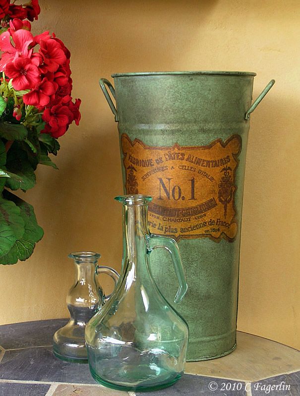
paint, clear sealer and some glaze gave my mis-matched flower buckets
a whole new lease on life.


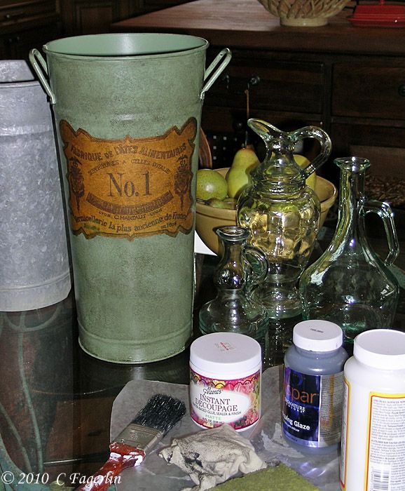
I printed out the graphics onto scrapbook paper, sprayed with clear sealer, glued down with instant decoupage, let dry, then glazed with a water based glaze from Lowe's.  When completely dry all the buckets were sealed with a couple coats of clear sealer.

So my group of mismatched, unloved flower buckets are now destined for
center stage holding roses from my garden this summer.


Monday, January 31, 2011

Kitchen Colors

I'm playing along with the everyone over at Nesting Place
with some of my Paint Colors

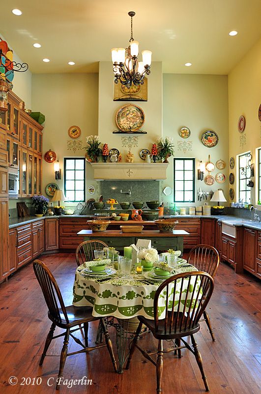
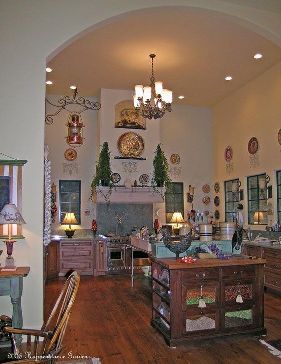
When we built this house in 2006, I treated myself to a couple of sessions
with a "color advisor."  With large expanses of wall areas and high ceilings, mistakes were not going to be made. It was important to get it right the first time around.

The BEST money I ever spent.  The first visit was on a dark cloudy day to the yet unfinished house with bare raw plaster walls. The second visit was on a sunny day.  Initial colors were chosen, color boards were prepared, a couple colors were eliminated, and final choices were made. An excellent 3 hours of time to choose one of the most important elements in the overall feeling in a home.

Second guessing decisions is a part of making so many critical choices over a few months time,  as a home goes from design to final result.  So it was that our painting contractor tried to talk us into "color matching" the brand of paint he preferred to the colors personally chosen by my color advisor.

Walls were painted with splashes of color from the chosen colors and
then side by side with the "matched" colors.  Not even close to the softness, warmth, "alive" feel of the real thing.  So the final decision was to go for the expert's choices and it was the best decision I ever made.  That being said, it is impossible to capture the way the colors of these rooms change with the seasons and with the light on any given day. They truly do reflect the "mood" of the day.

Kitchen Colors
Benjamin Moore
199 Barley
2144-40 Soft Fern
492 Dune Grass

A tip here from my advisor:
We dealt with only color #'s assigned by the maker, not the color names which can sway you just because of the emotional pull of one name over another.


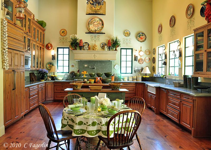
The exhaust hood bump-out over the range is 492.
The right hand wall and ceiling in these images is 199, which
is the main color used for many of the rooms in the house.
The back and left hand walls are 2144-40.
The light playing on the back wall changes the whole look of the color.

My limitations as a photographer make it hard to convey the true beauty of these colors, but let me assure you that I wouldn't change a thing after four years.


Thanks for stopping by to visit!

Friday, July 9, 2010

Timberlake Island

I'm joining up with Jenny Matlock for Rainbow Summer School
This week's color is Yellow!


Come on over to Between Naps On The Porch for Susan's weekly extravaganza!
It's time for Metamorphosis Monday!

I'm joining in on Saturday Night Special over at Funky Junk Interiors with a makeover that has been in my mind for the last three years.  I've finally done it!


I'll also be linking up to Furniture Feature Friday over at Mustard Seed Creations
with one of my all time favorite pieces of furniture.

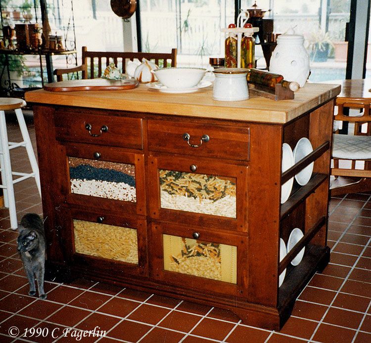
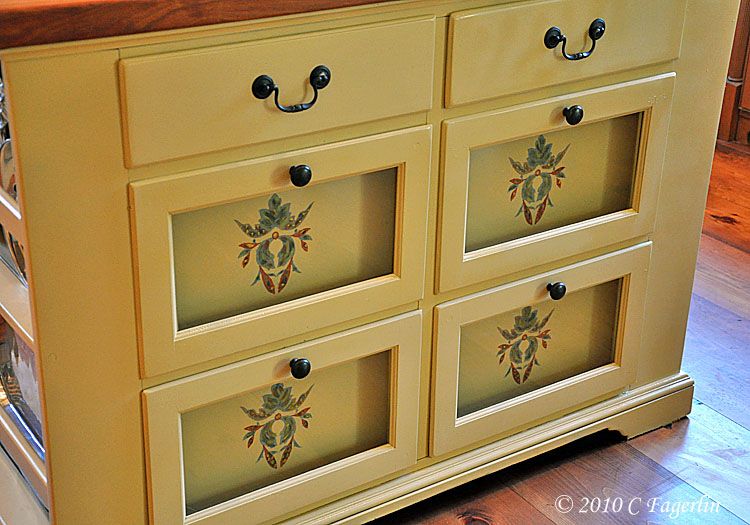
Timberlake Island is a wonderful free standing kitchen piece I've had for about twenty years.
Made by Bob Timberlake, it has been in the kitchens of our last three homes, as well as spending
a few years in my daughter's kitchen and a few years in storage because it never really worked in
our last house.  Here it was circa 1990 in our house on the water in Marin.


And as it appeared in one of the positions it has held in my current kitchen.
I have several free standing pieces that I use in the kitchen and I rearrange
them frequently.  The large stainless prep table has moved to the greenhouse
recently, as it was a catch-all for "stuff" and wasn't being used as a prep table. :-)


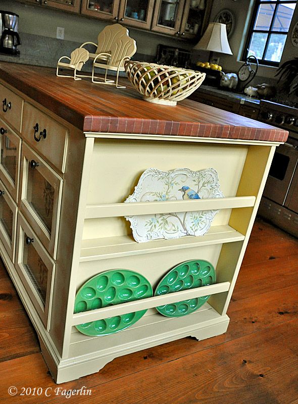
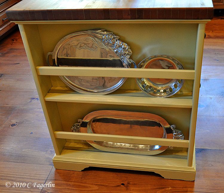
The wood island is extremely heavy even when empty. Each side has 4 large drawers and two small drawers, plus a plate rail on either end.  It also has a wonderful butcher block top that has been refinished twice in its 20 year lifetime.  I refinished the butcher block 3 years ago shortly before we moved to this new house and it has taken me all this time to figure out how I wanted to refinish the base.

Considering paint colors.

My favorite outdoor green was too green.
My favorite neutral "Fossil" was too gray.
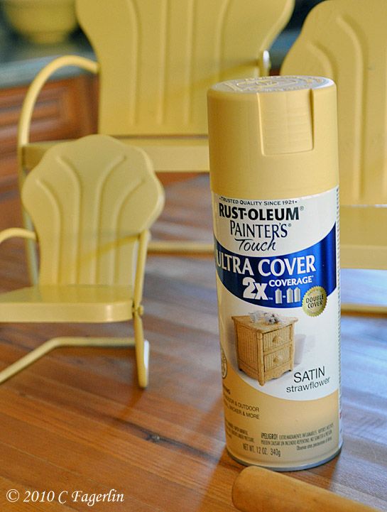
So my final choice was my new favorite "Strawflower"


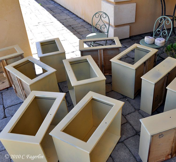
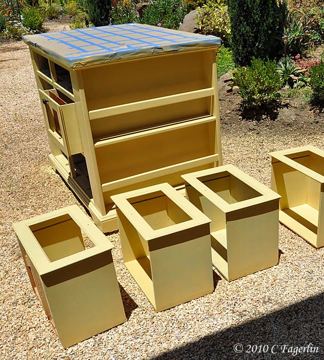
A sea of drawers, some primed and some with a first coat of Strawflower


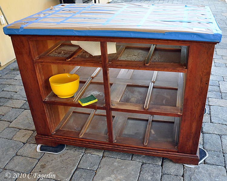
I chose to wash the base with lacquer thinner, rather than try to strip it completely or sand it, which would have been difficult with all its crevices and inaccessible places. The butcher block
top was bleached with a solution of Chlorox and water, thoroughly dried and then covered in paper and taped up.


And the paint went on.


More paint


And a coat of clear sealer before I brought it back inside.
It was positively glowing in the bright afternoon sunshine.


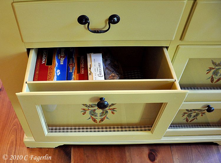
The spacer panels in the fronts of the large drawers were still the original finish, so the
next step was to test out some ideas I had for painting them and doing something decorative to them. The glass front panels also needed to be reinstalled.  I won't be putting the beans, peppers, pasta back in the drawer fronts ...... it takes constant vigilance to make sure creepy crawlies don't make their homes in the bin fronts.


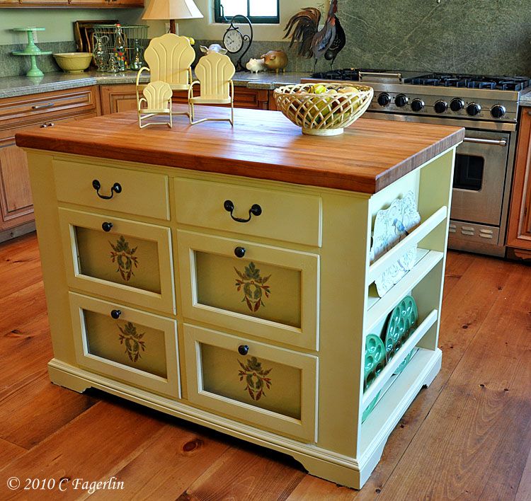
And here is the finished product.  I'm liking it so much better, much lighter and brighter.
It's like having a whole new piece of furniture! The butcher block top received a heavy coat
of mineral oil and will probably need another in a week or so.


EDIT 7/14/10:
I received a number of questions on the stencil I used.  It is a portion of
the larger stencil I used on my kitchen walls, although I used more intense
colors on the island rather than the muted colors I chose for the walls in the kitchen.
I also did some freehand embellishment to give it a more rustic look.
Originally I had planned to sand the wall stencils to give them some "age", but as it
turned out I liked them just the way they were. :-)


So that's one more thing I can mark off on my summer TO DO list.


Thanks for coming by for my Saturday Night Special and Furniture Feature Friday!

Thursday, July 8, 2010

Sneak Peek of Upcoming Saturday Night Special

I'm just so surprised that so far no eagle eye readers have spotted a tiny glimpse of my upcoming makeover for Saturday Night Special on Funky Junk Interiors this week!!

I get a lot of emails and questions about things in images I post ....... things I never notice until they are pointed out to me.  So after I posted this week's Tablescape Thursday images, I realized that I had probably let the cat out of the bag.....but then nobody has even mentioned it. LOL

Can you guess what the makeover is about this week?
I've talked about it before on other makeover posts.

Can you spot what is being made-over??


Here's a hint ..... it's hiding behind the green table. :-)

Will you stop by for my Saturday Night Special post this week?
I sure hope so!!

Thursday, July 1, 2010

Tête-à-Tête


Come on over to another Saturday Night Special at Funky Junk Interiors!

I'm participating in Show and Tell Friday over at Cindy's My Romantic Home.
Drop by to see all the pretties!


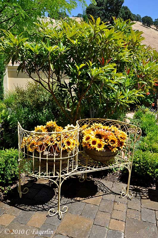
Another victim of my spray painting fetish!

A courting bench, also known as a kissing bench, conversation bench, or a tête-à-tête (French for "head-to-head") is a bench with two parallel seats, facing in opposite directions.
They were popular in Victorian times and were convenient for kissing and intimate,
but demure conversation, as the names imply.


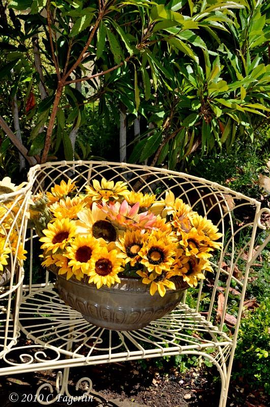
This courting bench lives in my garden and is sporting a new coat of "Strawflower" Rustoleum
spray paint.  It has been in a shabby, chippy white mode for a number of years, but now it has
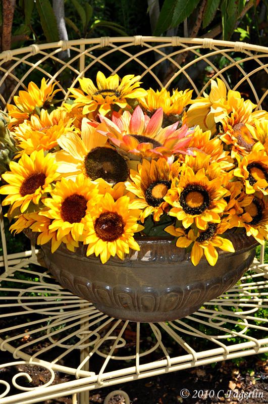
this new crisper attire.  It is holding two large glazed pots filled with sunflowers.


Thanks so much for stopping by to visit!

Thursday, June 3, 2010

Earrings On A Pig Part Deux

Back on May 2nd I shared one of my projects with you - Earrings On A Pig


and

Here's Part 2 of the project.  Part 2 actually should cover the 8 chairs, but I've
chosen to only do 4 of them to start.  It seemed like a more realistic goal and
I won't need the other 4 until Christmas ..... it seems so far away right now, but
I bet I'll be glazing the remaining four chairs right up until Christmas dinner!
I tend to procrastinate ... a LOT.


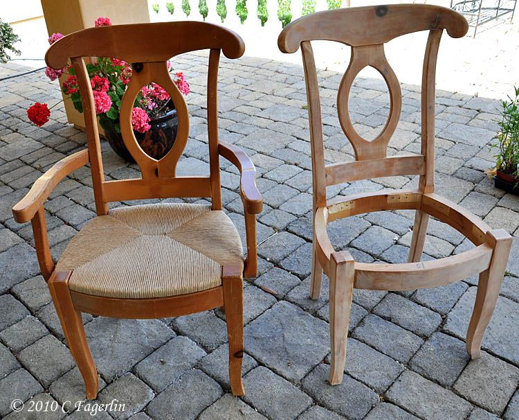
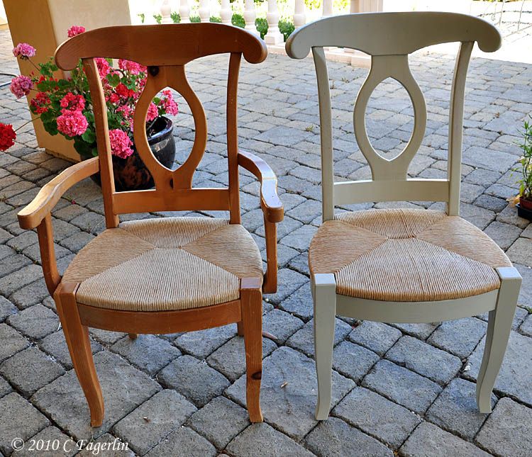
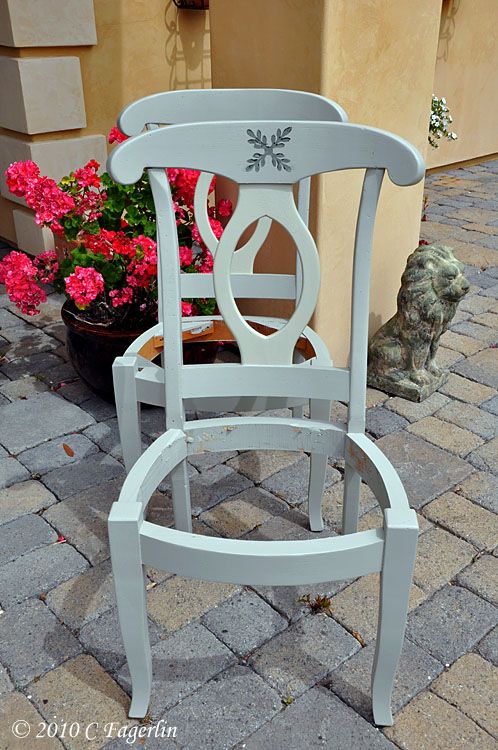
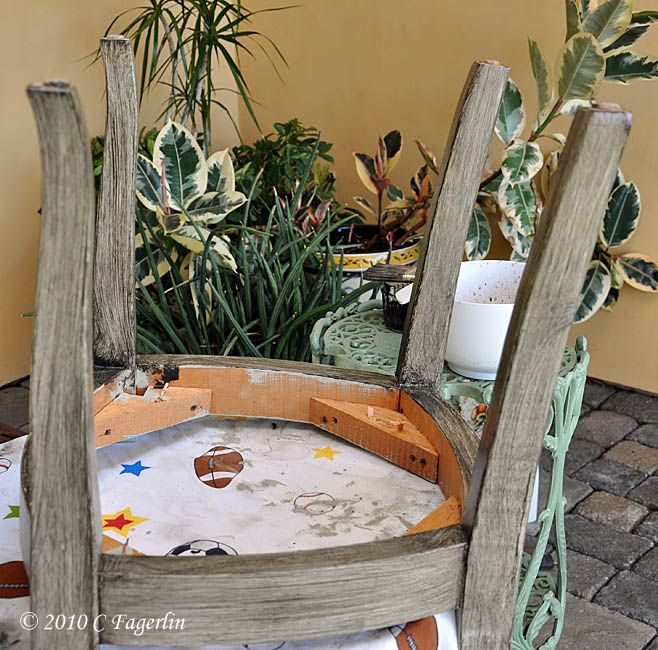
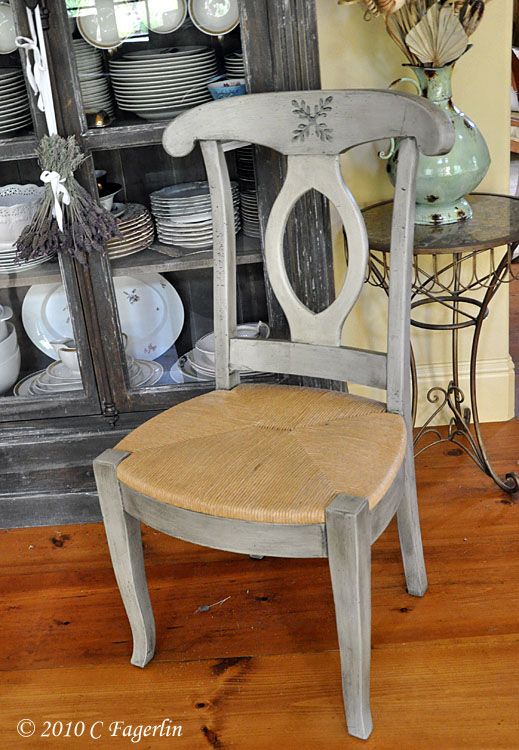
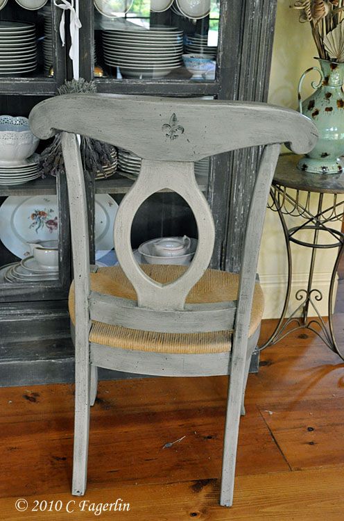
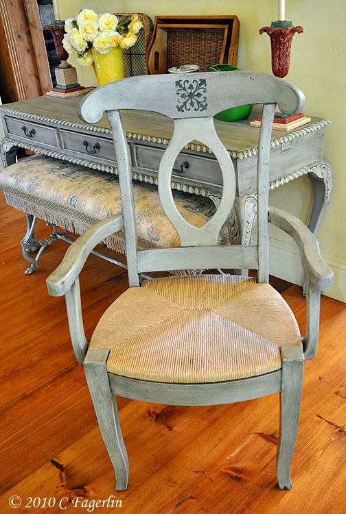
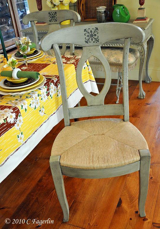
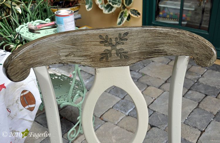
I've had these 8 pine chairs for 20 years ..... you see them everywhere.  They are mainly used for extra seating for holiday meals and the rest of the year they live in the top of the garage.  My plan was to paint them and make cushions out of my favorite green toile, but once I painted them the woven seats didn't look so bad and they are very comfortable chairs.  Maybe tie on cushions can be a winter project????


A couple of coats of grey paint and a little stamp adornment.


My favorite easy water clean up glaze from Lowe's.  No science to this, just
brush it on. My secret to easy glazing is one of those yellow kitchen sponges with
the green scrubby stuff on the back.  Wrung as dry as possible and used to wipe
down the glaze once it becomes just slightly tacky.  This stuff is very forgiving and
can be worked for a very long time.


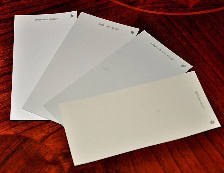
Two shades of grey paint from Martha's new line at Home Depot.


I have my eye on a little side table from a thrift store that I've had for years
 ..... could it be the next victim of "greying" ????

More images of the tablescape can be seen at The Happenstance Rose and Shrimp Boats

EDIT:

I'm adding a couple of additional images and the color names of the paint I used.
These are all from Martha's new line of paint carried at Home Depot.


From left to right:
SANDPIPER MSL257, CITYSCAPE MS 209, MOURNING DOVE MSL210, ASH BARK MSL211

Mourning Dove was used as the base coat on the table, bench and the chairs.
All four colors were used on the table details.
Ash Bark was used on the center back of the chairs.
The stamp detail on the chairs was a "wrought iron" craft paint.

The glaze came from Lowe's paint department.
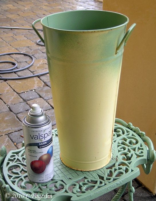
(Ignore the spray paint to the left below, it was used in another project


Sunday, May 16, 2010

Three Heads Are Better Than One


I'm linking up to Metamorphosis Monday hosted by Susan over at
Between Naps On The Porch this week. come on over and check
out all the make overs and clever ideas.

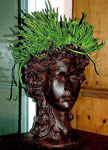
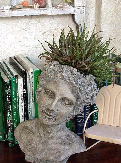
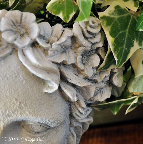
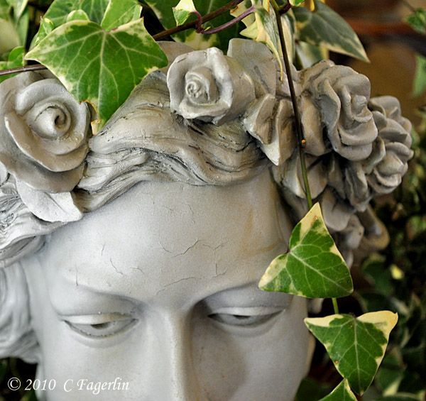
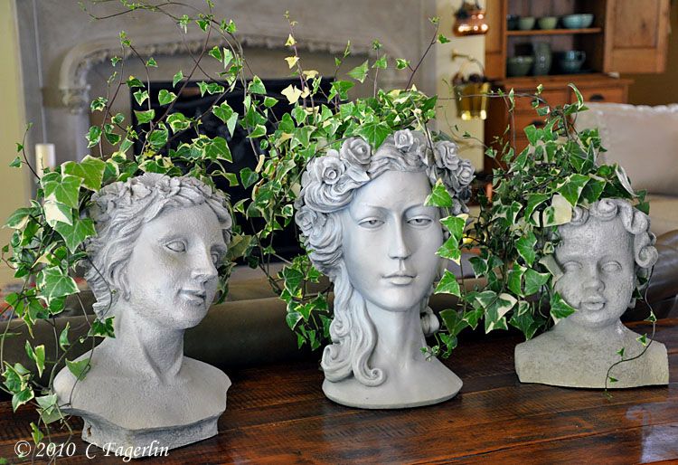
I've had these planters for years and they've had several different
"doos" over the years.  In their most recent incarnation they lived
outside with succulents for hair.  After a super cold and wet winter,
they were really in need of a new style.


At one time this gal's hair was really pretty, but after winter
she was balding and had brown roots. :-)


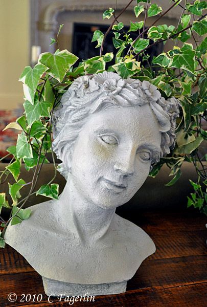
And here she is with her new style, just need it to grow in a bit!


And this gal had black mush for hair at the end of the winter, but
she is now joining her friend with the trailing ivy look.


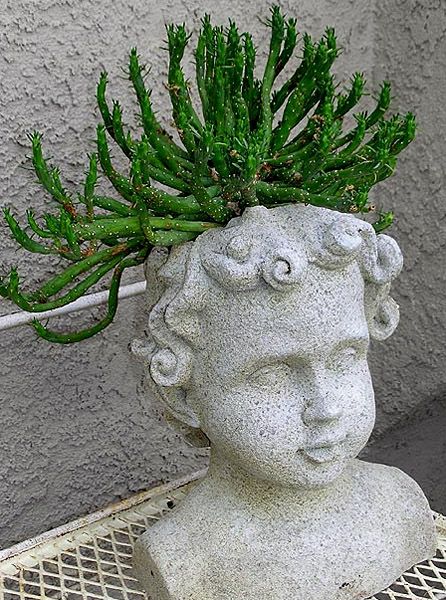
And their little cherub buddy, was the saddest of all, water
logged and moldy.


Seen here in better times several years ago and below with
his new look.


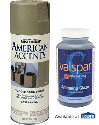
A can of "Fossil" spray paint and some glaze gave all three a new finish.
EDIT : 5/17/2010  Here are the two products I used for this project:


Thanks for stopping by, hope to see you again soon.
Related Posts with Thumbnails